Members Login
Username 
 
Password 
    Remember Me  

Forum: Zone Art & Fashion/Comic Strip

Graphics Skills & Video Light Fashions displayed here | Mek life into a cartoon.
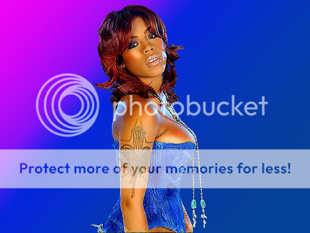
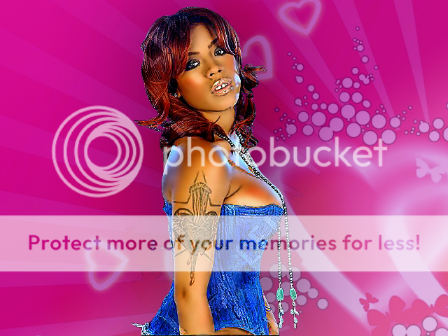
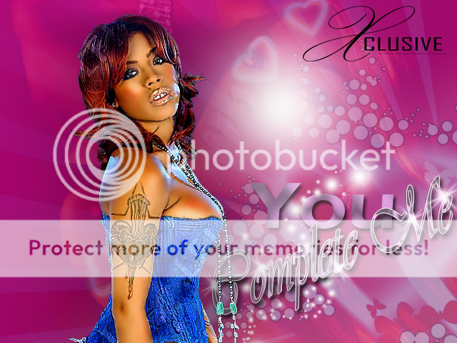
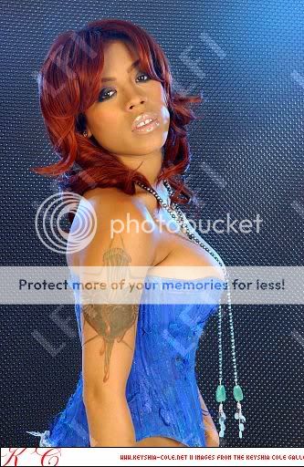
Okay basically I spent 3hrs on this here designed and I did not eactly did it to the best how Id want the result to be. What I did was was a technique I developed called tooning its kinda of a cartoonish effect mostly used on mixtapes and T-Shirts its mostly common overseas well less talking you all be the judge of it lol


Original Photo

keyshia_cole_193639m.jpg


Part 1
part-1.png


Part 2
part-2.png


Part 3
part-2.png


Part 4
part-4.png


FINALE A LA RESULTE "Watever that mean"
Final-Result.png


MORE DESIGNS DROPPIN SOOOOOONNNNNNNNNN
LiKe Di SKy , LeT Mi PLaNe PoN Di MouNTaiNs

http://www.mediafire.com/?z0lyw5goddz


dp1dp1sayhello2dp1dp1

(graffiti) Owkes - WSR Crew

July 19, 2009
Started By owkes0 Comments
Back with some new stuff....

5776_108914847804_94156762804_2731432_2942278_n.jpg

4876_97982717804_94156762804_2532158_2147527_n.jpg

4430_85616807868_574027868_1930836_914253_n.jpg

6214_106446773683_831093683_2101951_748372_n.jpg

6214_106446778683_831093683_2101952_55514_n.jpg

6214_106446783683_831093683_2101953_4904972_n.jpg

6214_106446788683_831093683_2101954_2598046_n.jpg

6214_106446793683_831093683_2101955_3287486_n.jpg

hope you like.....
Before

2cckkux.jpg

after
rcshog.jpg

and then i went back and did sumthing proper
23vydz4.jpg


-- Edited by K17 on Thursday 9th of July 2009 07:45:06 PM

CHECK IT OUT NOW!!!

July 7, 2009
Started By dJrEaLeSt2 Comments
Reviews plz..

BEFORE

29ej2av.jpg


AFTER

r8bfxt.jpg

copy and paste the url in the address bar to view original size [  http://i32.tinypic.com/ejvud4.jpg ]


-- Edited by Da MaGiC oNe on Sunday 12th of July 2009 02:16:34 AM

Norcotic Vybz Flyer

July 9, 2009
Started By Ranade17 Comments
How does it look, what is it missing ?

2hx6hlj.jpg

5768_98879573949_751808949_1939543_446919_n.jpg

...CALL OR PM FOR WESTERN UNION DETAILS...


-- Edited by brainz on Sunday 5th of July 2009 07:56:27 PM
Well this was made by one of the promoters of the Party, NOTE* I in no way had anything to do with this pic >_>, the promoter wanted to get your feedback on his after hearing my results and plz dont show up the guy too much k :O

coldsweat2.jpg?t=1247203278


-- Edited by Ranade on Friday 10th of July 2009 12:21:51 AM
tah9ns.jpg


-- Edited by K17 on Thursday 9th of July 2009 07:21:12 PM
Tiny pic a f*k itself so pree dat fi di time being Maddd


[center]k17.jpg[/center]

http://www.flickr.com/photos/35361328@N05/3353113229/


-- Edited by K17 on Saturday 14th of March 2009 11:11:36 AM
my second I change the car's colour
it's a Ford Shelby GT 500 , Blue like the other near and I drop a Black colour on it ""I have not changed the color of the glass (they are blue)
i change the rims colours too they were chromed i make them gold

fordshelbygt500bx5.th.jpg

-- Edited by marseye at 11:30, 2008-03-24

-- Edited by marseye at 11:32, 2008-03-24cy

deleted post

June 12, 2009
Started By chaddt5 Comments


-- Edited by chaddt on Wednesday 7th of September 2011 11:00:55 PM
jsluyp.jpg comments are appreciated
havent posted in a while been tryna get better and i was hella bored lol

2lm9vm1.jpg


k21fh3.jpg

gaza to di f*kin world madmad
Is it too dark.. are wat?cprlcMonday nite karaoke1w copy.jpg

-- Edited by Dj Quiva on Friday 3rd of July 2009 09:08:44 PM
These are the two  pics i used  plus brushes and gradients.

lil-wayne.jpg


lil-waynen.jpg


And The Final Result Is

lilwayne wallpaper.jpg


-- Edited by Dj Quiva on Friday 3rd of July 2009 08:26:43 PM
Got it in tha mail today...suh just a show the applications tha comes with it...will do a full video review of them soon, lol, after i get fi kno dem a lil bit.


below.gifsayhellobelow.gif


qr1c77.jpg

Super High Definition View


-- Edited by J-goose productions on Saturday 27th of June 2009 04:40:03 AM

XPLICIT's Designz/fri.26.july

June 26, 2009
Started By Xplicit7 Comments
5122_121526539831_640499831_2921052_2563644_n.jpg WHAT DO YOU THINK?
Yea was done for CAMMAN to help out with his Dj Profile 275ds.jpg
VIEW

comments are always welcomedbiggrin


BEST VIEWED IN MOZILLA FIREFOX


-- Edited by J-goose productions on Monday 29th of June 2009 10:42:05 AM
mauwk0.jpg


sig

2hwmdzn.jpg

crycry

-- Edited by K17 on Friday 26th of June 2009 11:49:29 AM
THIS IS WHERE HE GOT THE ORIGINAL MOMENT

MAD SKILLS


-- Edited by Nickquane on Thursday 25th of June 2009 11:14:38 PM

choDOE COMMENT IF YUH AGUH WABBLE...


******first Stage******

2f04pp3.jpg2q2rcrd.jpg28kpu2s.jpg2itrhvk.jpg


******Second Stage******

34eov0w.jpg2wpmixi.jpg2qicis1.jpg10r08hs.jpgny8h9x.jpgi40aat.jpg


bman_______________sayhelloydadsblessydadssayhello_______________bman

PREE

Costed $35.00


-- Edited by J-goose productions on Friday 19th of June 2009 10:25:43 AM
One of my many projects just  posting this one that I did for a customer recently

MISSING zONE MEMBER =O

June 21, 2009
Started By K1740 Comments
2nhf5uq.jpg
8zhh0o.jpg

i'm not feeling it , need your views and reviews HONESTLY!
well i've done alot more designs since my 1st post however i did these (jus idling around wit photoshop)  it wasnt anything  big but yea...   ppl think them good
2j661ph.jpg


http://www.brusheezy.com/brushes


Wed, Oct 10, 2007


Part Three of Seven Easy Principles to Becoming a Master Designer.


contrast in your design


Good contrast in your design goes hand-in-hand with your color
selections. Contrast is the value difference between the colors on your
design. Value is how bright or dark the color (ink) is. Ever see a
blank white canvas and as a joke someone says: Hey its a white cow
in a snow storm! This is an example of no contrast. White on white is
no contrast you cant see anything.


Elementary right? I mean what kind of stupid tutorial is this? Im explaining that the piece Im designing needs to be visible?? This is a retarded concept for a tutorial right?


Wrong.


Because unfortunately, I see lots of problems with designers
contrast all the time. Not only that, but contrast, when used properly
can be an important tool.


Here is one big mistake I see frequently: Designers use color
difference to produce contrast instead of value difference. For
instance a medium value blue sitting on top of a medium value red
produces some contrast. You CAN see the difference between the two. But
when you have two colors together of the same value it produces what
is known as vibrating. Youll notice that at the line where the blue
and red meet your eye seems to oscillate back and forth between the
two. It almost feels like the text is pulsing.


insufficient contrast


If your goal is to produce something really vibrant you can use
this technique. But its hard on the eyes and most people will find it
annoying. Here is another example of the same design using different
colors that have more contrast:


proper contrast in your design


This second one is obviously much easier on the eyes.


A quick way to evaluate your design to see if there is sufficient
contrast is to convert the entire thing to grey scale momentarily and
see if the design still looks clear and easy to read. In Illustrator
you do this by selecting your design, and select: Edit>Edit
Colors>Convert to Grayscale. In Photoshop youll need to flatten
your work then you can select: Image>Adjustments>Desaturate. This
will convert it to Grayscale.


In either case, youll want to undo this action once youve had a chance to see how your design looks put to this test.


Here is a sample of the same design one with good contrast, one
with bad contrast. And just under each one is how they both look in
grayscale.


good and bad contrast


You can clearly see how much easier it is to read the text in the
design on the left, particularly when its converted to grayscale. The
design on the right uses less contrast and more color difference to
define the shapes.


One question I get all the time is: what opacity setting should I
use for a background water mark? I think a good watermark background
should be between 10%-15% opaque. Once again this is all about
maintaining contrast in your design. If the background is light then
the watermark should obviously also be fairly light and vice versa.
Here is an example of a good and bad watermark:


set watermarks at 15 opacity


set watermarks at 15 opacity


The last little thing I want to note about contrast is how it can be
used as a tool. If, for instance, you have a need to direct your
audiences attention to something specific on your design you can
accomplish it with contrast! You might keep the entire design
relatively light and then make the one spot you want your audience to
focus on dark. Here is an example of a well designed landing page:


good contrast in a design


This is a page on E-Harmonys tour section of their website. While
they want to give people a tour, what they REALLY want to do is get
people to actually sign-up. So, when you look at this page what is
the biggest darkest thing on the page? Its a non-clickable picture of
a girl and the Get Started Now button. Obviously they want you to
click on the Get Started Now button. Look at how much bigger and
darker the Get Started Now button is compared to the Next Step
button. The Next Step button is what someone on the tour SHOULD be
pushing to continue the tour but how tempting is that Get Started Now
button? And why? Why does it jump off the page at you? Simple
CONTRAST!


This concludes a fairly basic but fundamentally critical lesson in
design. Thanks for taking the time to read this. Four more basics to
go. After that I promise Ill teach you how to draw!


ALSO SEE HERE

http://www.mediazoneja.com/forum.spark?forumID=101645&p=3&topicID=28740632


-- Edited by K17 on Friday 19th of June 2009 11:32:55 AM

-- Edited by K17 on Friday 19th of June 2009 11:33:51 AM

-- Edited by K17 on Friday 19th of June 2009 11:34:27 AM
Click to View


just a cut an go through di whole a dem.
iq8zd0.jpg


Yuhhpp...so This is My New Movie "FRACTURE"
...all special effects where done by me...it wuz initially a school project, but yuh know me, I always have to go beyond...well, its a action/DBZ theme type of film...so yah yah...N'joy-->>Oh, and look out for "Green Ener-J", my new production...ydads

Ps:
this took like a month to complete.


pps:
this iz one of the reasons I havn't been posting like one tyme.


pps[ps]:
I the best.


-- Edited by J-goose productions on Monday 8th of June 2009 03:37:03 PM
[youtube=http://youtube.com/watch?v=pZ0adXaY_bs]

drawing-overlap3-trans.pngdrawing-overlap3-trans.pngdrawing-overlap3-trans.png

Become a Master Designer: Rule Two: Limit Your Colors


Design Tip


rules for color use

Rule Two: Limit your colors.
Part Two of Seven Easy Principles to Becoming a Master Designer.

Rule Two: Limit Your Colors. Sounds a lot like the last rule of limiting your fonts right? Exactly! We want to limit our colors for the same reason we want to limit our fonts. Reducing the number of colors we use in our design will make the piece feel consistent. Basically, everything will look like it goes together. Just like a sports teams uniform or a companys branding we want a uniform over-all look to the colors.

As with the font selection, limiting the number of your colors is just a guide not a rule. You could very well have a rainbow of colors in your design and it will look great. But you need to start with a coloring strategy and stick with it. Use your color consistently throughout your design.

For starters lets talk about color values. A colors value is how bright or dark the color is. A yellow for instance is fairly bright. A purple is fairly dark. Of course, a color can have a range of values. Purple for instance is a color that most of us think of as relatively dark, but you can also have a very light purple. Here is an example of some colors and their relative value. Then next to that you can see a range of values for one color.

color values

So here is one rule I use when picking my color scheme: make sure you have a range of values in your color scheme. In any design youre going to need some light colors and some dark colors to produce contrast. If for instance, the background of your design is dark, youll need a light color so that the copy can be easily read. Or conversely, if you have a bright background youll need a dark color for your art or text or whatever.

I will also typically only pick 2-5 colors to make up my color schemes. Reduce the number of options and youll typically have good results in the design. Here is a sample of a color scheme I put together. As youll see I picked One dark color, one middle-valued color and one bright color. Just to the right, I also set up a value range for each of these colors. Its this collection of colors that I will use on my project as my palette. Once I have this color palette set up I will try my best to only use these color.

rules for color use

Ok, so now that weve addressed some technical color picking issues like how many colors to pick and what values they should be; whats next? Ill tell you whats next, the hardest part; deciding what those 2-5 colors should be! I personally find this to be a somewhat difficult task at times. Here is a list of techniques Ill use to help me pick my color schemes:

ââ¬Â¢ Stick to a temperature range. As in pick all warm colors or pick all cool colors. Warm colors are reds, oranges, yellows, browns, etc. Cool colors are blues and purples. I consider greens to be fairly neutral. If you pick all of your colors in one temperature range, they will probably go together fairly well.

ââ¬Â¢ Use a website like www.colourlovers.com for inspiration. This wonderful site is all about picking color schemes. You can just click through page after page of color schemes.

ââ¬Â¢ Keep an eye out. There are color schemes all around you. Look at packaging in the grocery store, look at the paint colors in your local Starbucks, look at Mother Nature! If you see something with a pleasing set of colors, just take a mental note and see if you can replicate it on your computer.

ââ¬Â¢ Pay attention to pre-existing company colors. Frequently I am playing off of some pre-existing brand colors. Ill look at their logo, color scheme and use that as my starting point. Then maybe just add a color or two.

Here are a finished design that Ive done which show fairly restricted color schemes.

rules for color use

As you can see, the tight color scheme and limiting my fonts really pulls everything together.

I know these lessons are the basics but these remain cornerstones of design. So, it never hurts for a little refresher.


See Also
Pt 1
http://www.mediazoneja.com/index.spark?forumID=101645&p=3&topicID=28710183

Degree no degree?
http://www.mediazoneja.com/index.spark?forumID=101645&p=3&topicID=28676524

-- Edited by K17 on Thursday 18th of June 2009 10:00:21 AM

-- Edited by K17 on Friday 19th of June 2009 11:36:35 AM

Become a Master Designer: Rule One: Limit your fonts

rules for font use

Part One of Seven Easy Principles to Becoming a Master Designer.

Ok, master designer might be a bit of a stretch but you can at least become a proficient designer by following 7 easy principles. This will be the shortest, most informative series of blog posts youve ever read on how to become a better designer. Please note: these principles CAN be broken these are not laws, theyre just general guides that I typically follow when putting together a design.

Follow these simple design principles and youll be on your way to artistic excellence.

Principle One: Limit Your fonts. A big part of putting together a good design, as youll see, is making sure the over-all look is consistent. The best way to accomplish a consistent look to your design is limiting the number of artistic motifs (themes) that you use. The fonts you select are the first variable you want to limit. I typically like to pick just 2 fonts per design.

The first font can be fancy or artistic. This font will be used to give your design some flair, character and personality. Its this font that sets the mood for the piece. Is it a fun font with swirls for a girls party, or is it a grungy evil font for a rock band? I would use this fancy font for the header copy anywhere its big, Ill use this font. The fancy font will be the focal point of the piece. You will usually have less copy in this fancy font, but it will be much bigger so thats what people will see and focus on.

The second font should be very basic. The audience shouldnt take notice of this secondary font at all. This secondary font needs to be very easily legible. Its this basic font that will be used for large bodies of copy. Obviously, its very hard to read large bodies of copy that are in some extravagantly artistic font. So, this second font is all about functionality.

Here is an example of proper use of fonts in a design. As you can see, there is only two fonts used here. The fancy font is used as the headers and the basic font is used for the copy. It looks clean and consistent.
rules for font use

Here is a Bad use of fonts. In this case I used too many fancy fonts. It just makes the piece look inconsistent. The sub sections dont seem like they match with the main header.
rules for font use

Having too many fonts in a design is the biggest mistake. Nothing looks worse than someone who has used 8 different fonts on their flyer. Even worse than that is using a very fancy font for your body copy. Here is a sample of font use at its worst:
rules for font use

One last thought before I let you go. If your fancy font looks modern or contemporary, then your basic font should be a san-serif font. If your fancy font looks old fashioned, then use a serif font for your secondary font.

Thats it for this quick post. Thanks for reading. Keep an eye out, 6 more posts coming in this series (one post per week.)

-- Edited by bLaCkBeatZ on Wednesday 17th of June 2009 09:40:58 AM

Barton Damer was kind enough to let us repost this article on the zine. What do you think? Do you need a degree to be a designer these days?

Degree or no degree?

There are many potential paths you could follow in the world of design. Graphic Art is the term I gravitate towards the most for my own work. Theres often a fine line to distinguish the difference between graphic art and graphic design but it usually relies on less layout of typography and more visual development. A growing field for graphic artists is Motion Design (aka motion graphics). At its basic level, you are simply making your graphic art move. Ultimately, it helps to know a lot about all aspects of design whether its web, print or motion. Eventually, youll find your sweet spot but youll need a good base in design principles first.

School is always a good option but not necessary. Its a c****ination of motivation, knowledge and ability. If one is missing, the formula is incomplete. School will provide the knowledge to improve your ability. School not only allows you to learn great design principles and be critiqued by others, but you will always grow faster when you are surrounded and challenged by others who are doing the same. Additionally, the people you meet in school will go on to be in your industry and it always helps to have that connection 5-10 years down the road. School also helps you form discipline. Youll have to be highly motivated and naturally talented to make a career out of design without an education.

Not all design students are great designers. Motivation is the key to gaining knowledge. Not school. If you have the drive to be a designer, you will find plenty of knowledge online. You can also improve your ability and be challenged by online artist communities. Not going to school is definitely possible in this industry. I have friends that own their own businesses and write code for websites from scratch without ever having gone to college. There are designers that have made great livings for themselves without an art degree. Although skipping school is probably not the norm or the suggested method, going to school does not necessarily guarantee success either. Like any major, people often graduate and do not even find a job in that field.

I went to school for Commercial Art. I learned everything from oil painting to Photoshop. My experience, however, was that I learned principles in class; but not really the software. Learning software on your own or with the aid of tutorials, etc. is a part of the design life. The classroom was more about giving me projects and critiquing them. I learned and tried web design using Flash and Dreamweaver back in the day. I quickly gave that up. I realized that I needed to be able to write code to really have a future in web. That wasnt going to happen. Ive learned Final Cut Pro, After Effects, Illustrator, Cinema 4d, and all sorts of software on my own since school. The software is constantly changing so even if you find your classroom setting useful for learning programs; that wont help you 5 years after youve graduated school. Youll need to learn how to keep up with software on your own. There is no rest when it comes to keeping up with technology.
Overall, I would recommend a good education. That is not available to everyone though so buying a computer and software might make more sense if you are motivated enough to learn what is needed. A strong portfolio will speak louder than a resume or degree.

((GLAMA_RUE)) before & after

June 6, 2009
Started By Dj Tweety14 Comments
bmanDNT HATE CAZ rule JUST ME FLEX MEK PPL VEXmuu


affta.jpg


-- Edited by GLAMAROUS_RUE on Saturday 20th of June 2009 03:02:12 PM
«First  <  15 6 7 8 924  >  Last»  | Page of 24  sorted by